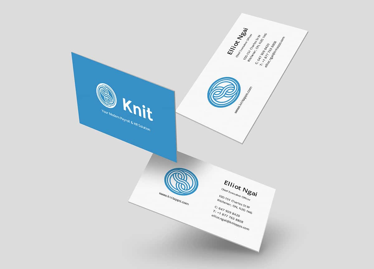
In this age of LinkedIn networking and online job applications, printed business cards might seem like a thing of the past. But a surprising number of creative professionals, especially photographers, are realizing the potential of business cards as an offbeat marketing tool. In the United States alone, 10 billion business cards are printed annually. The industry’s annual revenue clocks in at just under $800 million. There’s something undeniably memorable about handing a potential client a physical reminder of who you are and what you do.
For photographers in particular, business cards are a low-cost, high-volume way to tap into marketing. In the fast-paced creative world, the importance of in-person networking is greater than ever. Handing out your business card is a tangible way to get potential clients and partners to remember you and connect with your work.
It’s obvious that prioritizing beautiful design and clear, easy-to-read information will help keep your business card on top of that dream client’s desk, instead of in the trash bin. But what else can you do to make sure your business card stands out?
We spoke to Chad Jennings, Chief Product Officer at custom print company MOO, to get the industry scoop. Over the course of 17 years in the product and design world, Jennings has seen more than his fair share of business cards trade hands. We asked him about the best and worst business cards he’s ever seen, as well as his suggestions are for creative professionals who want to make the most of this ancient print tool in our very digital age.
Do creative professionals really still need business cards in 2017?
Absolutely! The business card has been around for over 300 years, and as a networking tool it’s still as relevant today as it was then. They’re a fantastic way to make a lasting first impression and, when designed right, can encapsulate a business and tell people everything they need to know about you and your work. For creative professionals in particular, having a brilliantly designed business card is incredibly important. In a predominantly digital age having a beautiful, tangible product will help you stand out.
How can business cards benefit photographers specifically?
One of the great things about business cards is that they work for all professions, including photographers. Thinking specifically about photographers at events or special occasions, they’re not only there to work but also to network. Business cards are an immediate and universally understood snapshot of your brand.
What is the most important element of a photographer’s business card?
I think it’s down to being able to show a real variety of work through images. While many photographers specialize in events or weddings, most need to cater to different clients depending on the job in hand. At MOO, we offer a unique technology known as Printfinity, which allows customers to print a different design or image on each card within a pack. For photographers, Printfinity allows them to have a mini portfolio on hand at all times, and adds an element of fun when the recipient can choose which card they would like.
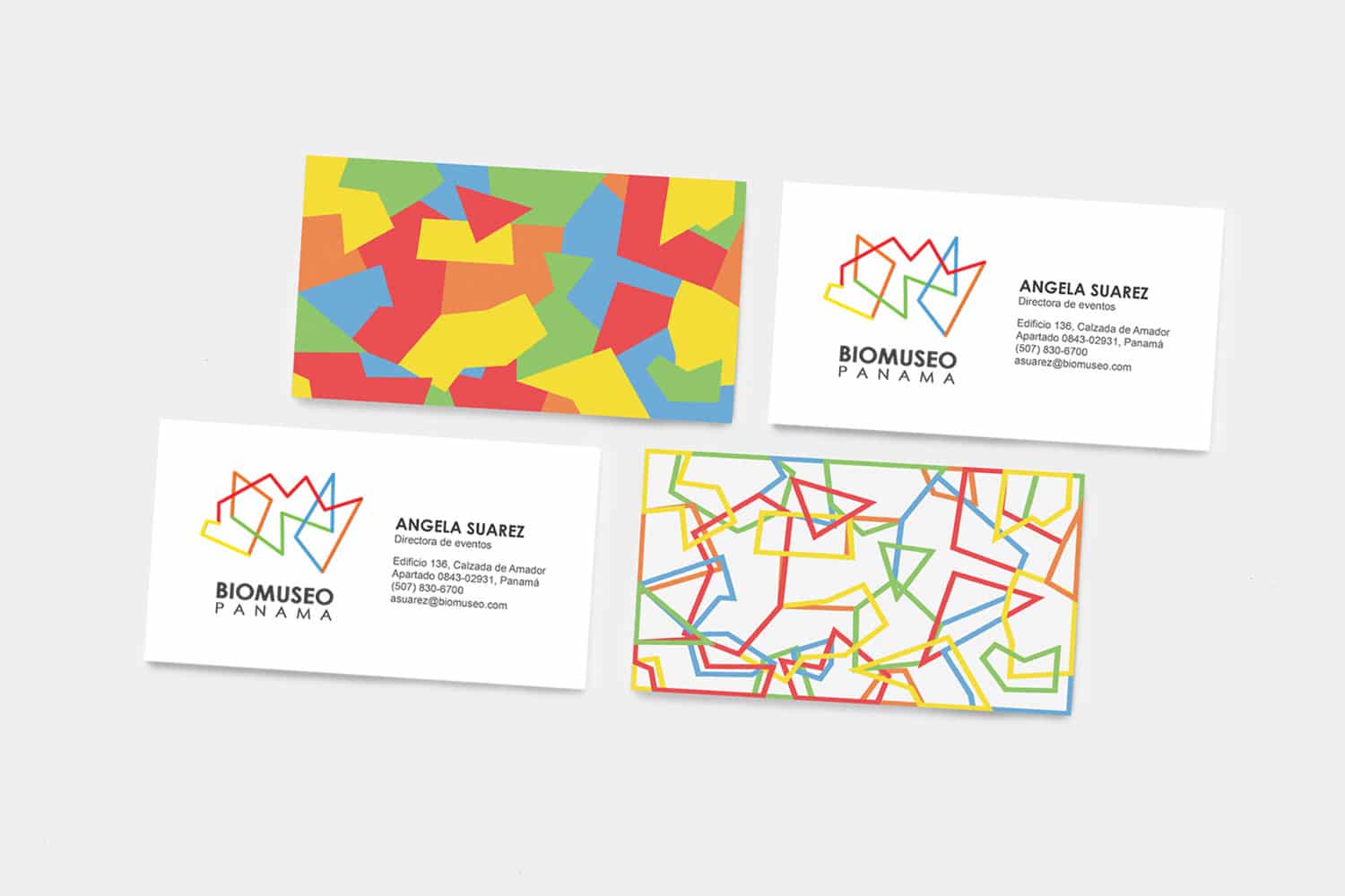
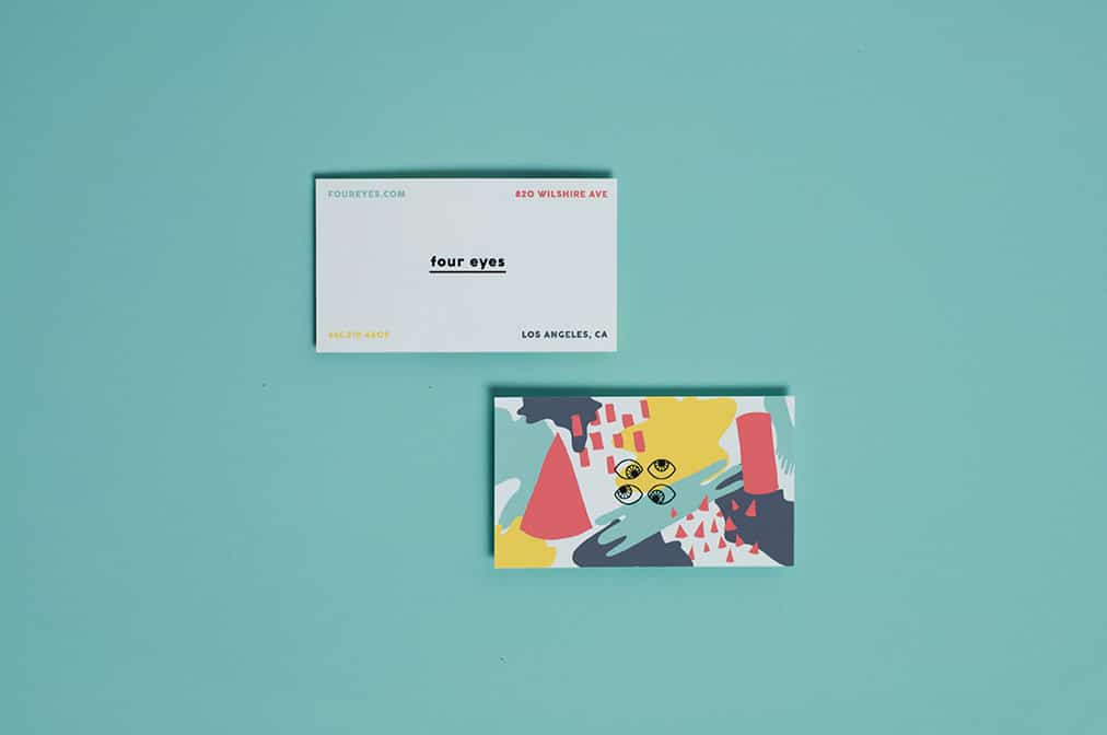
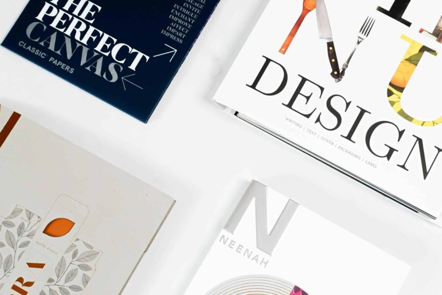
Business cards designed by Alejandra Paton (top) and Syd Rein (bottom).
What are the best and worst business cards you’ve ever received?
The most memorable was a music album created on our Near Field Communications-enabled business cards by a musician called Beatie Wolfe. That was a great testament to our product because the cards still served as beautifully printed business cards. They just happened to each feature a link to a different track on her album, available with a tap to an NFC-enabled device.
But in general, multipurpose business cards that also serve as memory sticks or mirrors or toothpicks are a personal peeve. I saw one recently that was made of metal and also worked as a wrench. There’s a time and a place for these kinds of business cards, and sometimes they’re made with a great sense of humor. But personally, I prefer those who keep it beautifully simple.
Any other business card pet peeves?
I often see people trying to cram too much information onto their cards. For me, it’s all about keeping it simple. Oh, and flimsy paper, it’s always disappointing if a card feels flimsy and cheap. Your business card is your brand and service embodied. If your brand attributes are bland, cheap, and flimsy, then perfect. Creativity is great, but it’s important to keep the core purpose of a business card in mind, and today this is as much about promoting your company as providing information.
How would you suggest updating business cards for today’s digital age?
We’re noticing that more and more people aren’t putting their phone number on their business cards any more. Along with their email address, we’re seeing the inclusion of an array of social media profiles and web links. But it’s really important to make sure all those profiles and links are up to date. If they aren’t, we’d recommend you don’t include them on your card. There’s no point featuring your Twitter feed if you rarely tweet anything. The most important thing is to be sure that your business card is a good representation of your creative work.
